Summary
-
I reproduced a published Bitcoin RSI strategy claiming a 57% win rate. The numbers matched during the published period, but in the 4.7 years after publication, returns shrank to +11%.
-
If you build the “this looks just like 2020” chart systematically — without cherry-picking — both rebound and crash precedents show up together.
-
The forward returns of the 5 most similar periods were statistically indistinguishable from random windows. So this tool is context, not prediction.
Does a Published 57% Win-Rate Strategy Still Work?
I reproduced it and ran it over the full history. During the published period (2018 to September 2021), my Profit Factor came out at 2.01, nearly matching the published 1.95.
But in the 4.7 years after publication, returns were +11% with a Sharpe of 0.07. The code wasn’t wrong — the published edge had simply expired.
The quant site QuantifiedStrategies published a Bitcoin RSI strategy: buy when the daily RSI(5) crosses above 50, exit when it crosses below. Published stats: 57.69% win rate, Profit Factor 1.95.
I reproduced the rules in Python and ran them on 8 years of Binance daily candles (2018-2026).
| Period | Return | Sharpe | Profit Factor |
|---|---|---|---|
| Published period (2018.3-2021.9) | +492% | 0.74 | 2.01 |
| After publication (2021.10-2026.6) | +11% | 0.07 | 1.15 |
Academia has a name for this: alpha decay. McLean and Pontiff tracked 97 market anomalies from academic journals and found returns drop by an average of 58% after publication. The moment a strategy goes public, capital piles into the same spot and eats the edge.
It’s like a hidden restaurant getting featured on TV. The quiet version of that restaurant never comes back.
So I Built the Pass/Fail Gates First
I built a verdict machine: feed it a strategy, and it stamps PASS or FAIL automatically. The key is freezing the acceptance criteria before seeing any results. If you set the bar afterward, you cherry-pick whichever metric flatters you.
The RSI strategy above failed this gate — and that is the machine working correctly.
The verdict machine checks four things.
-
Walk-forward — optimize parameters on one period, then test them on the next unseen period to see if they hold.
-
Parameter sensitivity — shake the settings. If one value shines and its neighbors collapse, that performance is luck.
-
Cost stress — double and quadruple the fees. A strategy that dies at 2x fees is not fit for live trading.
-
Pre-registered acceptance criteria — minimums like 100+ trades and max drawdown within -30%, frozen in code before any results.
The value of a verdict machine is not handing out a PASS. It is handing out an honest FAIL.
Building “This Looks Just Like 2020” With Exhaustive Search
I normalized the ‘shape’ of the last 60 days of price and compared it against all 8 years of history, picking the 5 most similar periods. The result was not one-sided. The closest matches were the COVID crash window (+30% afterward) and the entrance of the 2022 bear market (-11% afterward) — both.
The problem with the “this looks just like that time” overlay charts you see on YouTube is not the chart itself. It is the selection. There is never just one similar past, but the chart shows only the one that fits the narrative.
Exhaustive search takes four steps.
-
Take the log of price. This puts the $5,000 era and the $100,000 era on the same ruler.
-
For each 60-day window, subtract the mean and divide by the standard deviation. This z-normalization erases absolute price and keeps only the shape.
-
Measure the distance between today’s shape and every 60-day window in history. Closer means more similar.
-
Suppress overlapping windows, so one event cannot flood the rankings.
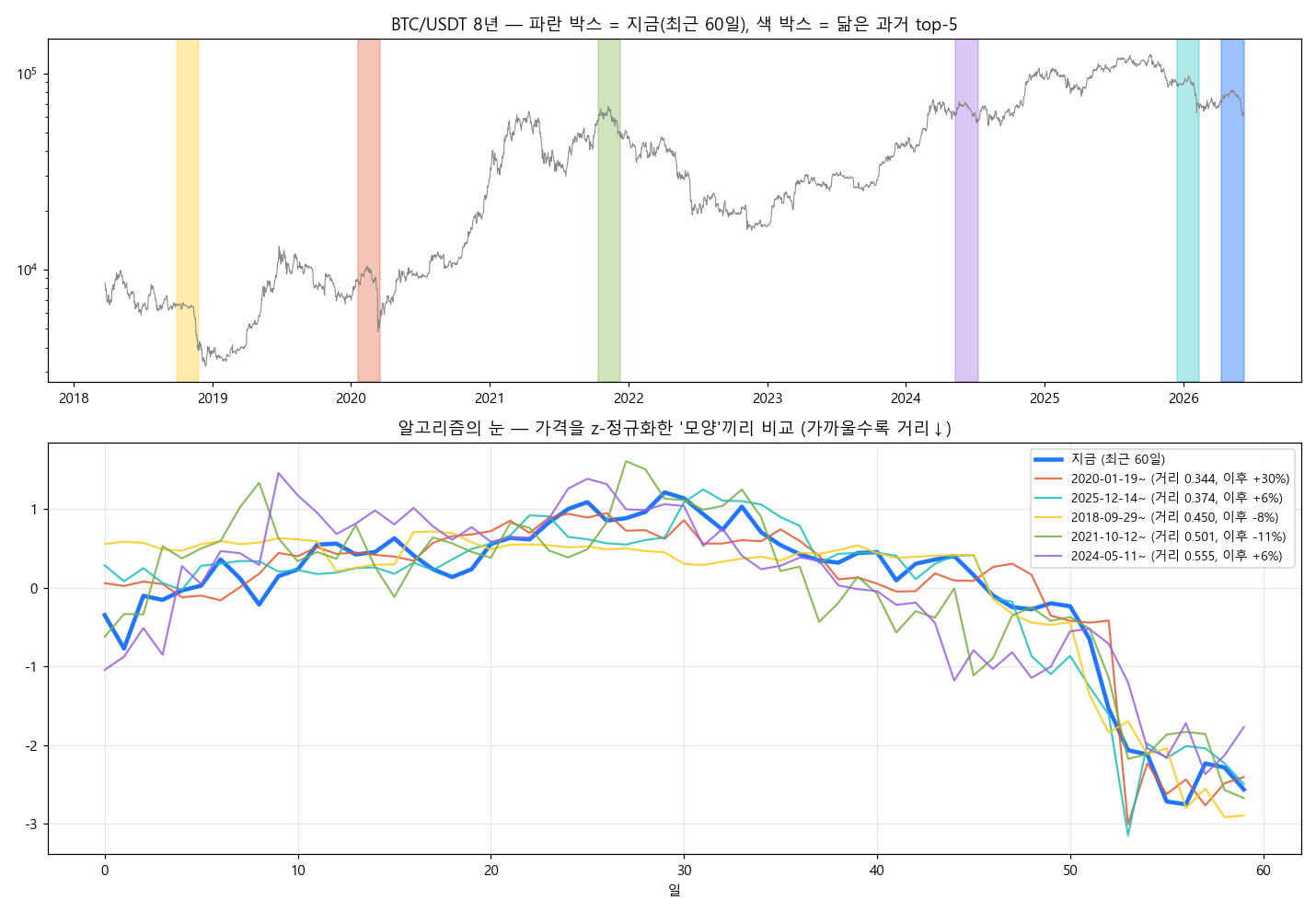
The picture above is the actual result. The thick blue line is now; the colored lines are the 5 most similar pasts.
| Similar past | What was happening | Next 30 days |
|---|---|---|
| Jan-Mar 2020 | COVID crash | +30.3% |
| Sep-Nov 2018 | Late bear market | -7.9% |
| Oct-Dec 2021 | Entrance of the big bear | -11.2% |
History says: after this shape, both rebounds and further crashes followed. Strip out the cherry-picking, and that is the honest answer.
It Is Only a Pattern If It Beats Random
The median forward return of the 5 analogs was +5.7%. But grab 500 random windows from history and the median is +1.5%, with +5.7% sitting comfortably inside the random distribution. With a sample of 5, you cannot tell it apart from luck.
This comparison method comes from Lo, Mamaysky, and Wang’s 2000 paper in the Journal of Finance. For a technical pattern to carry information, the return distribution right after the pattern must differ from the unconditional one.
So I pinned this tool’s role as context, not prediction. “After shapes like today’s, both rebounds and crashes followed. The worst precedent drew down -25%.” That is as far as the data permits.
Live Trades So Far: Zero
Everything so far is backtesting. There is not a single line of order-placing code. The next step is finding a strategy candidate that passes the verdict machine — and the rule is no entry, not even small, before a PASS.
Three takeaways from this round.
-
A published strategy starts dying the moment it is published. Reproduce it and check whether it is still alive first.
-
A “history repeats” claim becomes a pattern only after two tests: exhaustive search and a random baseline.
-
The most important part of building a validation tool is freezing the acceptance criteria before looking at results.
References
Primary sources behind the claims in this post.
-
QuantifiedStrategies — Bitcoin RSI Trading Strategy — the original strategy publication
-
Beluská & Vojtko (2024) — Revisiting Trend-following and Mean-Reversion Strategies in Bitcoin, SSRN
-
Lo, Mamaysky & Wang (2000) — Foundations of Technical Analysis, Journal of Finance
-
McLean & Pontiff (2016) — Does Academic Research Destroy Stock Return Predictability?
-
UCR Matrix Profile / STUMPY — the standard tool for time-series similarity search
Leave a Reply